
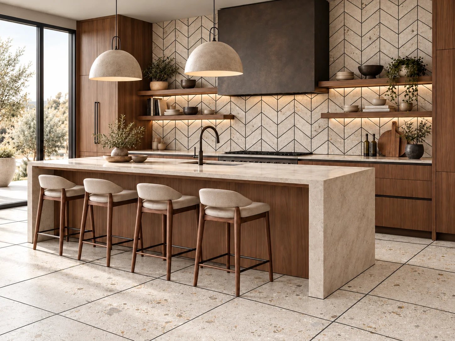
Dark grout adds depth and emphasizes shape.
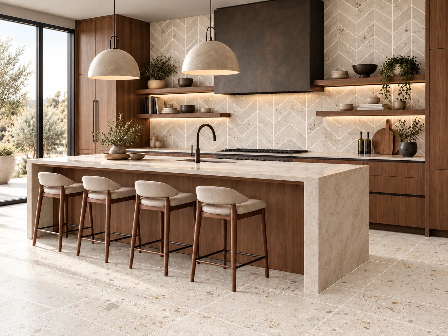
Light grout adds highlight to the surface.
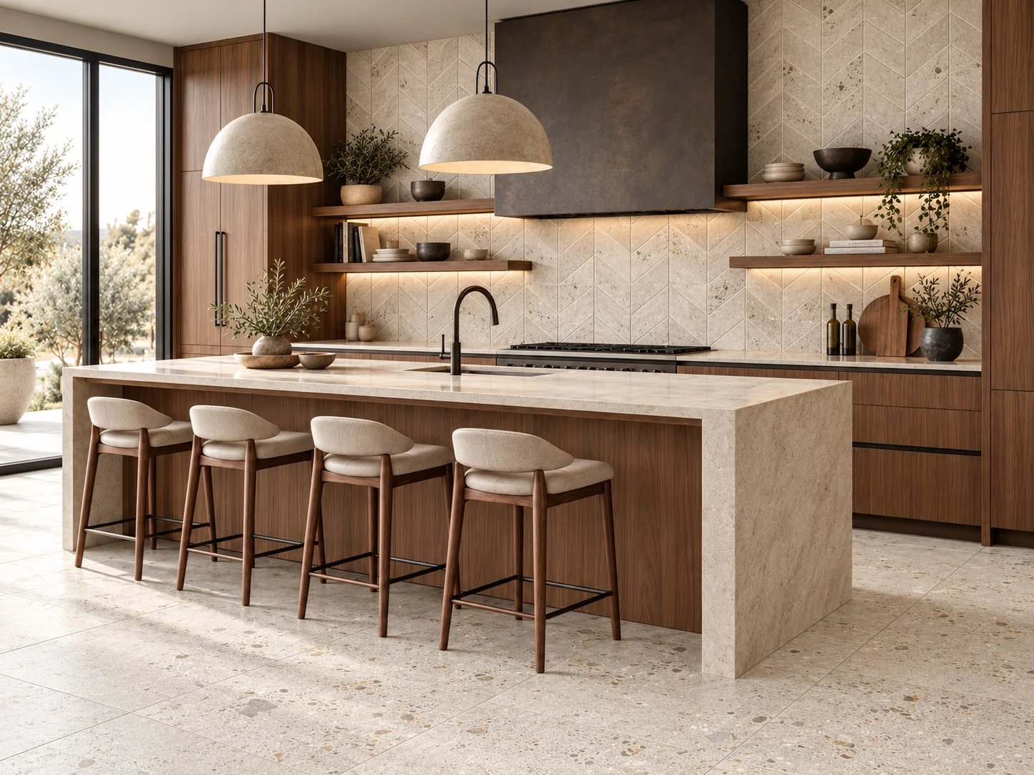
Matching grout blends with tile, unifying the surface.
Grout may be a finishing detail, but it can dramatically change the look of your tile. From soft, seamless surfaces to bold geometric patterns, the right grout color defines shape, highlights texture, and brings your design to life.
Find Your Look

The Power of Contrast
A contrasting grout color outlines each tile and brings the pattern to the forefront, creating a more graphic and defined look.

The Softness of Matching Grout
When grout closely matches the tile, the installation feels more seamless and the surface texture becomes the star.
A great example
One Tile Shape, Three Distinct Looks
The elongated pill tile demonstrates how grout color and layout work together to create dramatically different effects.

Off-Set with Black Grout
A dark grout transforms the pill tile into a bold design statement, creating strong shape definition and eye-catching negative space.

Matching Grout
Tone-on-tone grout softens contrast and creates a quieter, more refined interpretation of the same tile shape.

Stacked Pill Layout
In a stacked layout, grout creates its own geometry, adding structure and subtle pattern to the installation.
Hear it straight from our pros!
Watch how WFSB's Great Day Connecticut speaks to Joe Limiero in our West Hartford showroom to see how important grout color is to your next tile project. Choosing a grout color is a hugely impactful decision in the overall look of your finished project.
NBC CT visits Tile America in our Brookfield Showroom to talk to Lana Camera, our Product & Creative Director about the importance grout plays in the overall design of your next tile project.
DARK GROUT VS. LIGHT
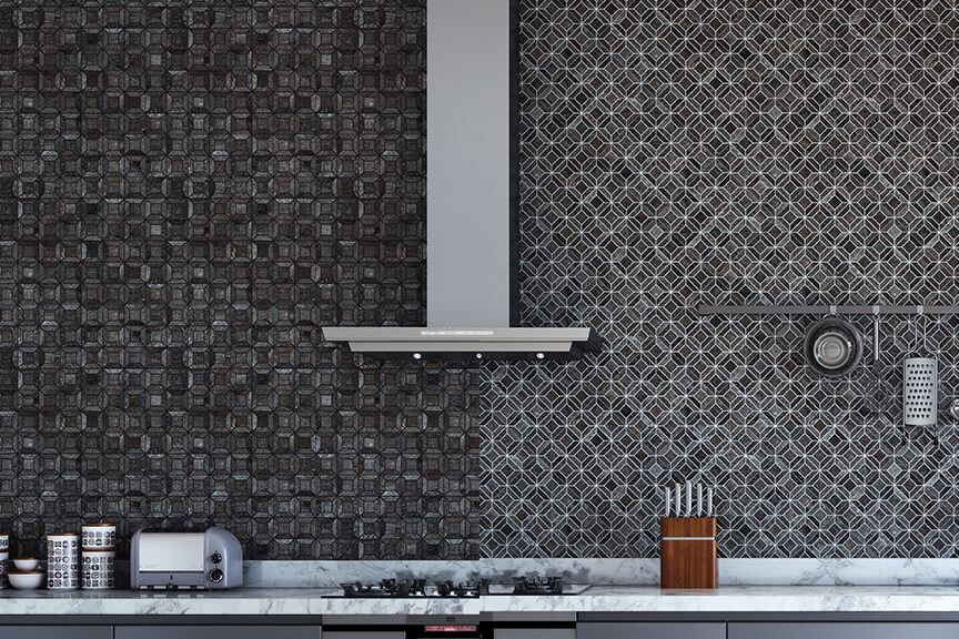
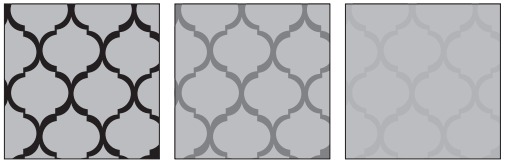
The grout's color will interact with the tile and impart the color to every nook and cranny. This said, you can emphasize the shape of the tile by using a contrasting color or you can minimize the tile's silhouette by using a matching grout color. The choices add another layer of complexity that can be very impactful. Talk to a design consultant to get it right!